(You can also read this on Medium!)
We all need housing to live a decent life, but paying for that housing is often a huge expense for Americans. Millennials spend 45% of their income on rent by age 30, for example. People often save up for years or decades to own a house. As such, the price of renting or buying a place to live presents one of the most important public policy concerns there is. To deal with this issue, accurate information is necessary.
I decided to look into data on home and rent prices provided by Zillow Research to see what I could find. Some of my results, such as a positive correlation between home and rent prices, you could probably figure out on your own. But others may surprise you. Let’s take a look!
Positive Correlation Between Rental Price and Home Price
The first month Zillow has data for both rental listings and home sale prices is March 2010, so I’ll talk about that month first:
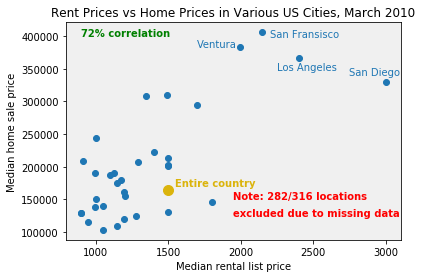
First, as I mention on the graph, even though Zillow contains information on 315 cities (and also the US as a whole), only 34 are plotted on that graph. That’s because the other 282 are missing the rental price, home price, or both for March 2010 in the Zillow data. We could try to estimate the missing data, but for now, just looking at these 34 is fine.
You might be unsurprised to learn that there is a positive correlation between the median rental and home price in a region; in other words, the higher the rents in your area are, the more expensive your homes likely are too (and vice versa!). Both prices are theoretically based on land value, after all, and the value of land shouldn’t change too much based on whether the person living in it owns or rents.
Interestingly, every city with the highest home price is in California. (What about New York City? It was one of the victims of the missing values, sadly.)
One might object that I’m only looking at one month, and one with a lot of missing data at that; this isn’t enough to show a correlation between both prices. That is true — so let’s focus on the US as a whole, and compare its home and rental prices on a month-by-month basis. In other words, each dot on the graph below represents a different month:

The positive correlation remains — indeed, it increases! This gives us more solid evidence that the two prices are related in some way. (Interestingly, the data appears to “cluster” on each side of the average, but I can’t really speculate on why that might be with the data I have on hand.) A positive correlation also appears if we take the average of all prices per region; i.e., for each region, we average its rental and home prices across all months this decade:
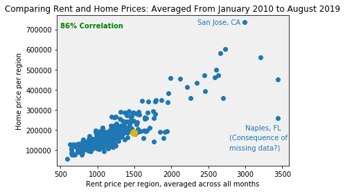
(The golden dot, as in the first graph, is for the country as a whole.)
Somewhat surprisingly, San Jose has the highest average home price, while the great city of Naples, Florida has a surprisingly high average rental price, given its relatively average home price. The latter result, however, may be illusory. In the Zillow data, Naples is missing its rental prices from earlier in the decade. As we will see later, rent prices have gradually grown from 2010 to 2019; as such, since my average skips over the missing data, Naples’s average rent price might be artificially inflated. But my main point is the positive correlation, which is not too impacted by artificial outliers, so this isn’t a huge deal for our purposes here.
Surprising Results: Quotients and City Size
So we’ve compared rental and home prices; what else can we do? We can also calculate the magnitude of the difference between the two! Because the home prices are so much higher than the rental prices, I think the best way to do this is to divide the former by the latter. Simple subtraction would end up reflecting the home price far more than the rental price; division does not have this problem. Examining the quotients that result leads to — in my opinion — some surprising results.
Before reading further, make a guess: from 2010 to now, has the quotient (the median home price divided by the median rent price) for the entire US gone up, gone down, or stayed the same?
For my part, I assumed the quotient would stay about the same, but the truth is the opposite:
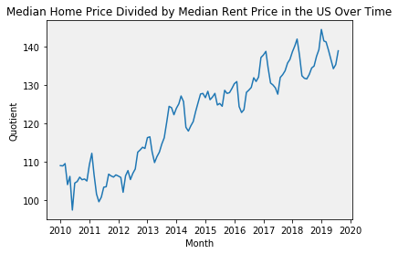
It’s gone up — and rather significantly (more than a 25% increase!). Why might this be? If we look at just the home and rental prices by themselves, we find the answer:
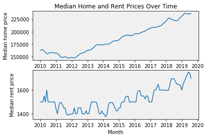
From 2010 to 2020, the median home price (top graph) has risen from around $160,000 to more than $225,000, more than a 40% increase. Rents have gone up too, but to a much lesser extent: from about $1500 to about $1700, less than a 15% increase.
Why such a huge difference? The Zillow data can’t answer that question, so here I will only speculate. USA Today reports that most of this increase comes from “affordable” homes, not luxury ones, partly because those prices crashed so much during the recession. It’s possible that home prices were hurt more than rent prices during the recession, so the recent increase is just returning to the norm. Alternately, in some ways home ownership is “subsidized” more than renting, due to the mortgage interest tax deduction (and indeed, the existence of mortgages itself); due to this, it’s possible that raising the price of homes doesn’t hurt demand as much as raising rent might. Again, though, these are only speculations; real evidence must wait for further research.
There is another useful facet of the Zillow data — it gives a rank for each city, with the bigger cities receiving a lower rank number. Again, make a guess before reading on: is the quotient (again, the median home price divided by the median rent price) larger in bigger cities or smaller cities?
Actually, that was a bit of a trick question. I assumed that the quotient would be larger in bigger cities, but in fact, it stays about the same regardless of size. Let’s look at January 2019, for example:
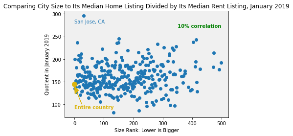
A correlation of 10% is quite small, and you can probably see from the graph itself that city size does not seem to have much of an impact on the quotient. This remains true when we average across all months:
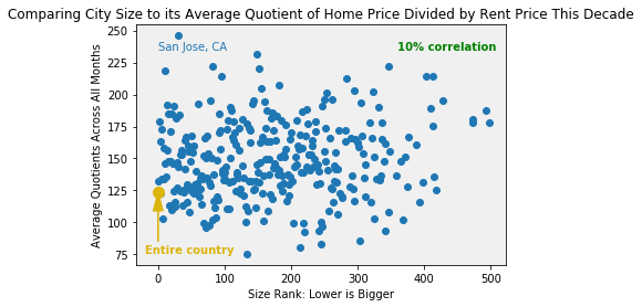
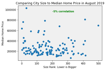
One might object that this is only natural; as we just saw, home and rent prices are correlated, so the quotient between them shouldn’t change much as we go from city to city. I think that’s true, which makes it even more surprising that even home and rental prices by themselves don’t seem to be correlated with city size!
There’s a bit more of a correlation for rent, but it’s still smaller than you might expect:
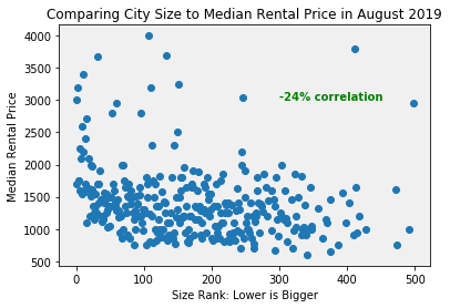
It appears, then, that city size is not the main reason behind high housing prices.
There’s much more that can be done with this dataset, not to mention the multitude of other data there is about housing in America and around the world. I hope this essay has demonstrated the value in analyzing this kind of data.
(These graphs were generated in Python. You can view my code here.)